Task #2110
closed
confusing download page for first-time user of site
0%
Description
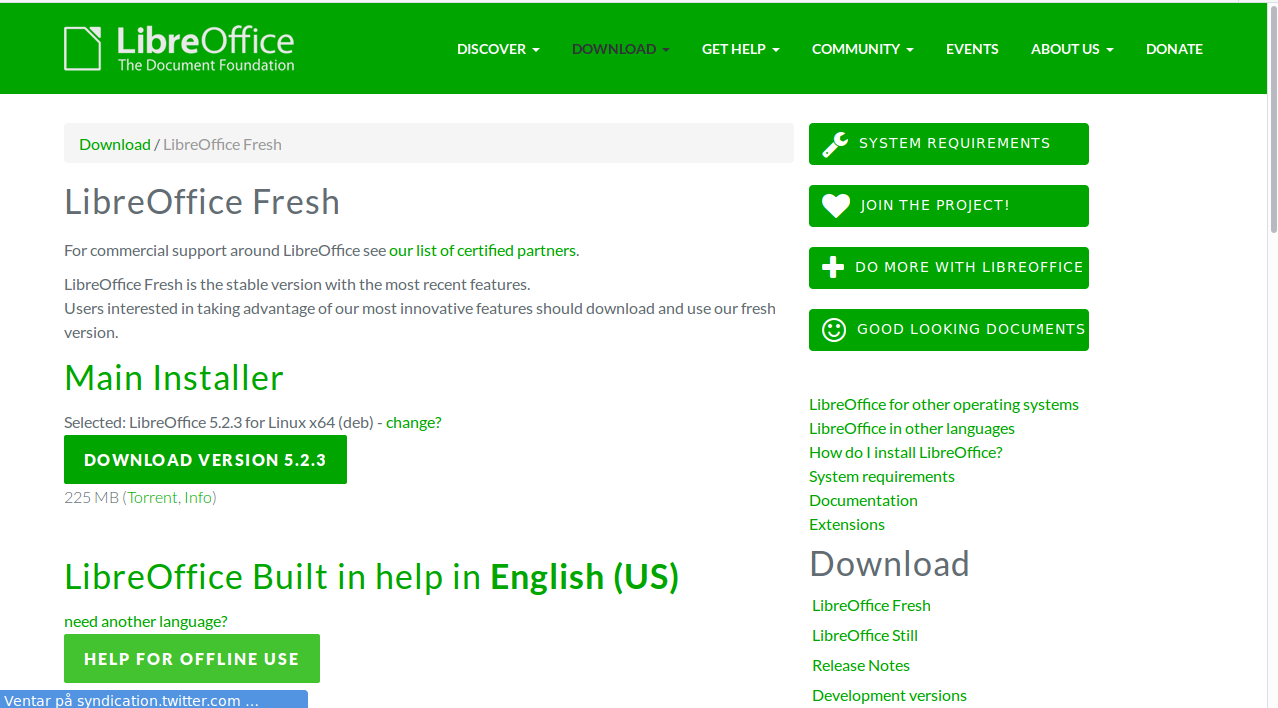
I was trying to help a friend of a friend who wanted a presentation program; pointed them at https://www.libreoffice.org/download/libreoffice-fresh/ and got some feedback: "Help, there's like a thousand things on that page … How do I get Impress, is it called Fresh now? I'm very confused."
And I agree: The page has too much information for the "90%" user who just wants the office suite and doesn't have the background knowledge to decide between Fresh vs Still (even I don't really – if I were to make that decision, it'd not be based on claims on this site, but on user experiences from third-parties), and doesn't even have the background knowledge to know that Fresh is an edition of the suite, and not a product under some LibreOffice brand.
I attached a minimal.png with some possible changes to the current.png, but this really needs the attention of someone who actually knows that UX stuff. I realise that LibreOffice is a huge project and there's lots of stuff people want to show off, but most of that should probably happen after the user has clicked Download.
Files
| current.png (112 KB) current.png | current page | ||
| minimal.png (79.3 KB) minimal.png | possible improvements, but IANAD |
 Updated by Florian Effenberger over 9 years ago
Thanks a lot for the feedback! There's already an internal ticket to
look into and improve the download page which we're working on. We'll
have a look at your proposals - thanks so much for that!
 Updated by Sophie Gautier over 5 years ago
- Status changed from New to Closed
I guess we can close this one as the download page has had a lot of improvements since this report