Task #2298
closed
"choose a project" landing page is not friendly to "quick scan"
0%
Description
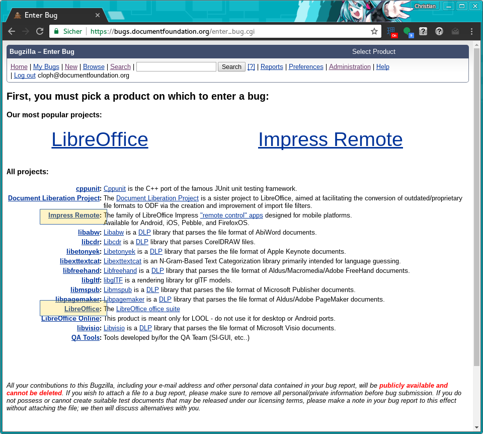
Try to create a new bug. One gets on a page that puts "our most popular projects" on top in huge letters, and "all projects" below in normal type.
Each time I land on this page, my eyes scan the "all projects" list without reading the rest because from the structure of the page, it looks like that's were the meat is, From the shape of it, it is a list, the only one one the page, and I need to select in a list, so what I need is there. The huge stuff on top is the title, I don't need to read that, it is boilerplate.
Except it isn't. I read the list several times, and the one I'm looking for, LibreOffice, is not there.
Solution: add "LibreOffice" and "Impress Remote" to the "all projects" list, so that indeed all projects are n the list.
I understand the point of the two huge entries on the top, you want to attract the eyes of the common user / bugreporter. By all means, leave those two huge entries if that's useful, i.e. non-geeks actually look at huge stuff. Just repeat them in "all projects".
Files
Updated by Christian Lohmaier almost 9 years ago
- File bugentry.png bugentry.png added
- Status changed from New to Resolved
- Assignee set to Christian Lohmaier
invalid/non-issue
both entries are there already - while the big ones at the top start the simple-entry from, the two entries in the all projects list use the "expert"/default bug entry form.
 Updated by Florian Effenberger almost 9 years ago
- Status changed from Resolved to Rejected
Indeed, looks as if not a real bug - #1063 might also play a role in getting the list shorter