Bug #460
closed
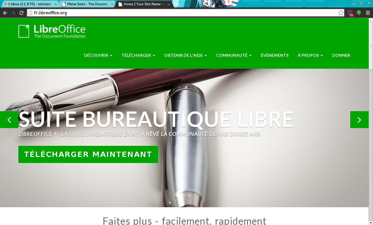
Lauch the FR site new design
Added by Sophie Gautier almost 12 years ago.
Updated almost 12 years ago.
Description
Hi Cloph, we are over with the translation and would like the new FR site to be make alive. Thanks in advance! Sophie
Files
- Assignee set to Christian Lohmaier
Assigning to Cloph, so he has it on his radar :)
Hi Sophie, *,
the navigation labels are very wide for french, making the navigation bar look rather ugly..
Thus I switched it back to the olddesign until there's a solution..
Besides using one entry less or using shorter labels, one could remove the logo/reduce it to the document icon, or try to make the menu split onto two lines or similar..
If you want to have it live nevertheless, i can enable it again.
Hi Sophie, Cloph,
I just tried the effect of the zoom in Firefox. If I use a text only zoom to reduce the character size it looks better (logo and menubar on the same line). So it is possible to reduce a little the size of the font used for the menubar ?
Best regards. JBF
Hi Jean-Baptiste, Sophie, *,
I tweaked the spacing and fontsizes for French, so they fit in one line at least in my chromium and firefox browsers - but that might be different on various browsers, so please report back if some browsers render it in two lines, so the paddings can be tweaked even more..
As the fontsize for the menu-entries is now set to 11px, it might hit browser's limits for minimum-fontsize...
Anyway - made it go live along with the Japanese site. Congratulations, you two are the first :-)
- Status changed from New to Resolved
Thank you very much. It looks OK on my Firefox on a screen 1366 x 768 pixels.
Best regards. JBF
- Status changed from Resolved to Closed
Also available in: Atom
PDF