Task #1877
closed
tweak membership application form
100%
Description
css needs tweaking to not look so ugly, as well as improving the email-reporting and the overall design of the form.
CSS already was adjusted, so that the option boxes and checkboxes align properly.
Files
 Updated by Beluga Beluga over 9 years ago
I noticed the input fields were crammed too closely to the elements following them, so I tweaked this rule in my browser and it looked better:
input, textarea {
margin: 0 0 1em 0;
}
Similar margin adjustment might be made so the sections (starting with h3 elements) would not be so tightly packed.
Rules have to be above Bootstrap css in the cascade to override the defaults.
Updated by Christian Lohmaier over 9 years ago
- Status changed from New to Resolved
added
div.field + :not(.field) { margin-top: 0.7em;}
div.field + .recaptcha { margin-top: 1em; margin-bottom: 0.5em;}
instead. (element that follows a div with class field will get margin-top of 0.7 (i.e. the headers after a set of fields), and if a recaptcha follows a div with a field, that gets 1em spacing above and 0.5 em spacing below. Gives a more balanced look from my POV → resolved.
Updated by Beluga Beluga over 9 years ago
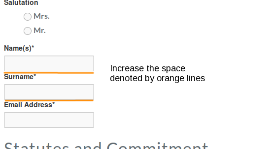
The input fields in http://www.documentfoundation.org/governance/members/application/ are still too tight vertically.
 Updated by Florian Effenberger over 9 years ago
Beluga Beluga wrote:
The input fields in http://www.documentfoundation.org/governance/members/application/ are still too tight vertically.
They look quite fine to me on Mac OS X, tested with Firefox, Chrome and Safari
Can you maybe share a screenshot?
Updated by Christian Lohmaier over 9 years ago
- % Done changed from 40 to 100
I further tweaked the layout by adding more spacing at the bottom of the input fileds, and also applying some margin from the left.
Also- tweaked the from to get rid of the duplicated renewal checkbox (as the user picks via radiobutton at the top), and
- moved the renewal-text at the top and made it conditional on the selection
- set the text/literal fields to not be included in the report
- added an additional mailnotification configuration with plaintext option to Cor, to see whether that better suits him (and if so, the one sent to membership request can be changed as well)
Updated by Cor Nouws over 9 years ago
just tested the form and the mail that I receive now looks fine.
Thanks for fixing this!
Cor
Updated by Florian Effenberger over 9 years ago
- Status changed from Resolved to Closed
Updated by Jean Spiteri over 8 years ago
- Category changed from Webserver to SilverStripe